Visualising experimental data in plots
You can make plots to visualise data from the Experiment. Plots use data in a Data Sheet and are configured using the settings panel on the right side.
To add a new plot, click the New plot tab, configure it and click Save.
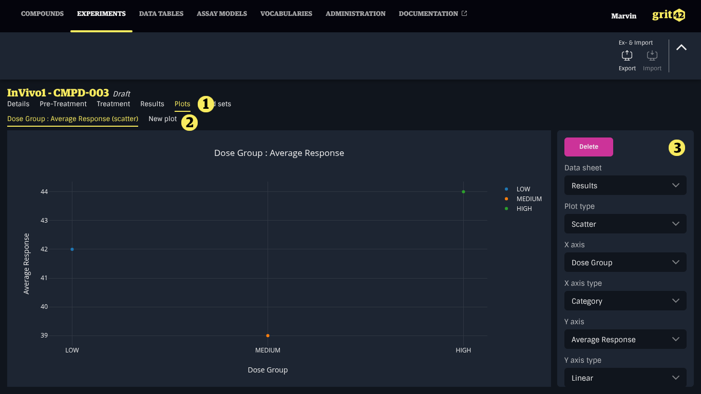
- The Plots tab
- The New plot tab
- The settings panel
- x-axis shows all columns of the selected data sheet, its type can be linear, log or category
- y-axis shows only numeric columns of the selected data sheet, its type can be linear or log
Supported plot types
grit currently supports Scatter and Box plots.